The challenge: How do you bottle nostalgia? How do you make a logo feel like home?
Seedo’s is a Palestinian bakery rooted in tradition. They needed a brand identity that honored their heritage while standing out in a modern market.
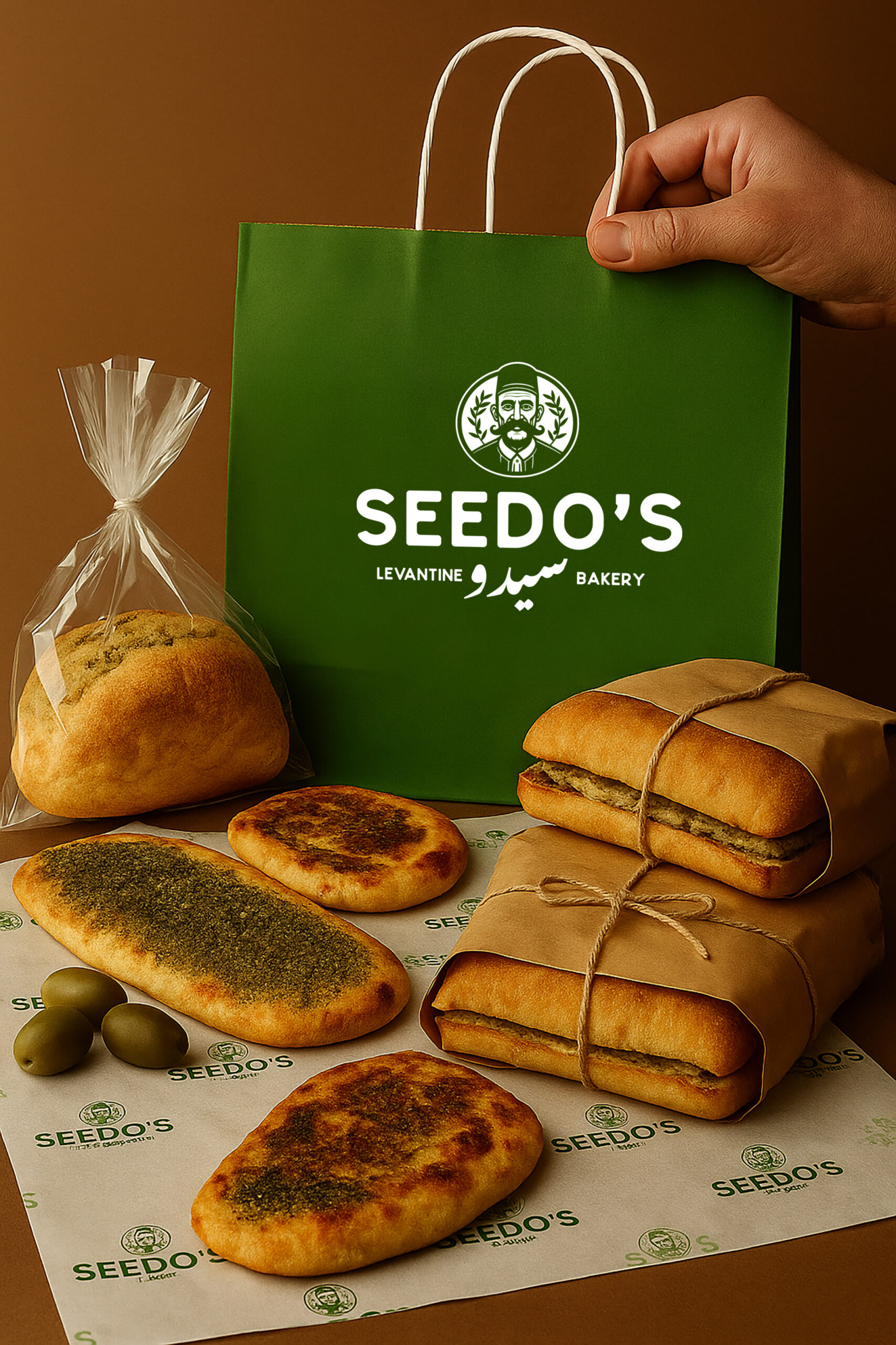
In Arabic, “Seedo” means grandfather. For this bakery, that word carries weight. It’s not just a name—it’s a lineage. Generations of bread-making. Recipes passed down through hands, not cookbooks. Most bakery brands go one of two routes: → Rustic/artisan clichés (wheat stalks, rolling pins) → Minimalist/modern (geometric, soulless) Neither felt right. Seedo’s needed something HUMAN.
The most powerful brand icons aren't abstract marks.
They're people.
The most powerful brand icons aren’t abstract marks. They’re people.
Think about it: → Colonel Sanders (KFC) → Chef Boyardee → The Quaker Oats man → Wendy’s A human face triggers trust. Relationship. Story. For Seedo’s, that face is a grandfather. Warm. Weathered. Wise. Palestinian. A face that says: “I made this for you, the way my family has always made it.”
Hand-drawn character illustration…not stock, not AI. Every line crafted to feel human, imperfect, warm. The grandfather wears a traditional keffiyeh. His expression is gentle. Welcoming. He looks like someone you’d trust to feed your family.
→ Earthy browns (soil, heritage, roots) → Warm wheat tones (bread, harvest, sustenance) → Olive greens (Palestinian olive groves) → Cream/off-white (warmth, authenticity) No sterile whites. No corporate blues. Colors that feel like a kitchen, not a boardroom.
This project isn’t just about bread. For Palestinian culture, for any culture facing erasure, branding can be an act of preservation. A logo can be memorable. A brand can be resistance. A grandfather’s face on a bread bag that can say we exist.