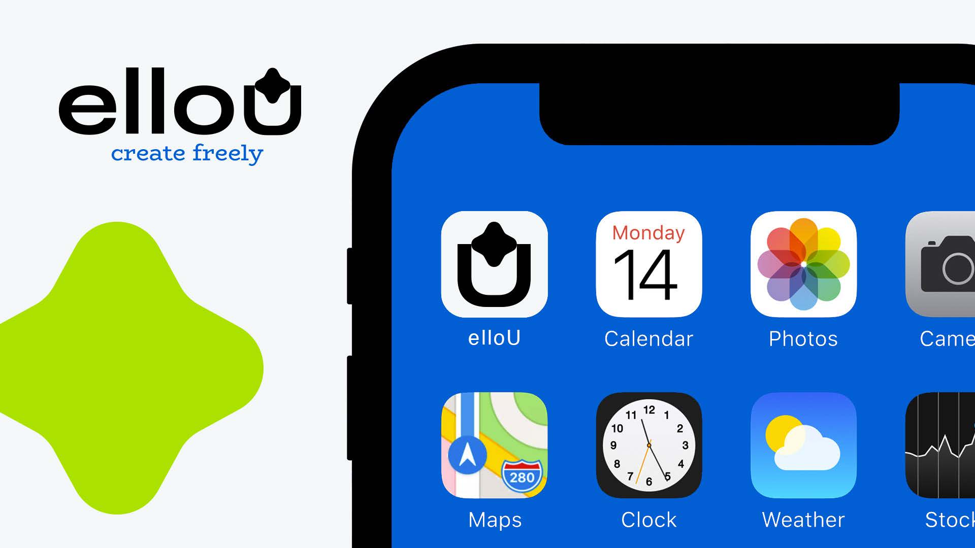
When a Banking App Stops Acting Like a Bank: The Branding That Gave Creators a Home 💙
Fintech has spent a decade trying to win trust by erasing personality. Minimal. Sanitised. Impersonal. Logos that look like they were designed by a committee afraid of color.
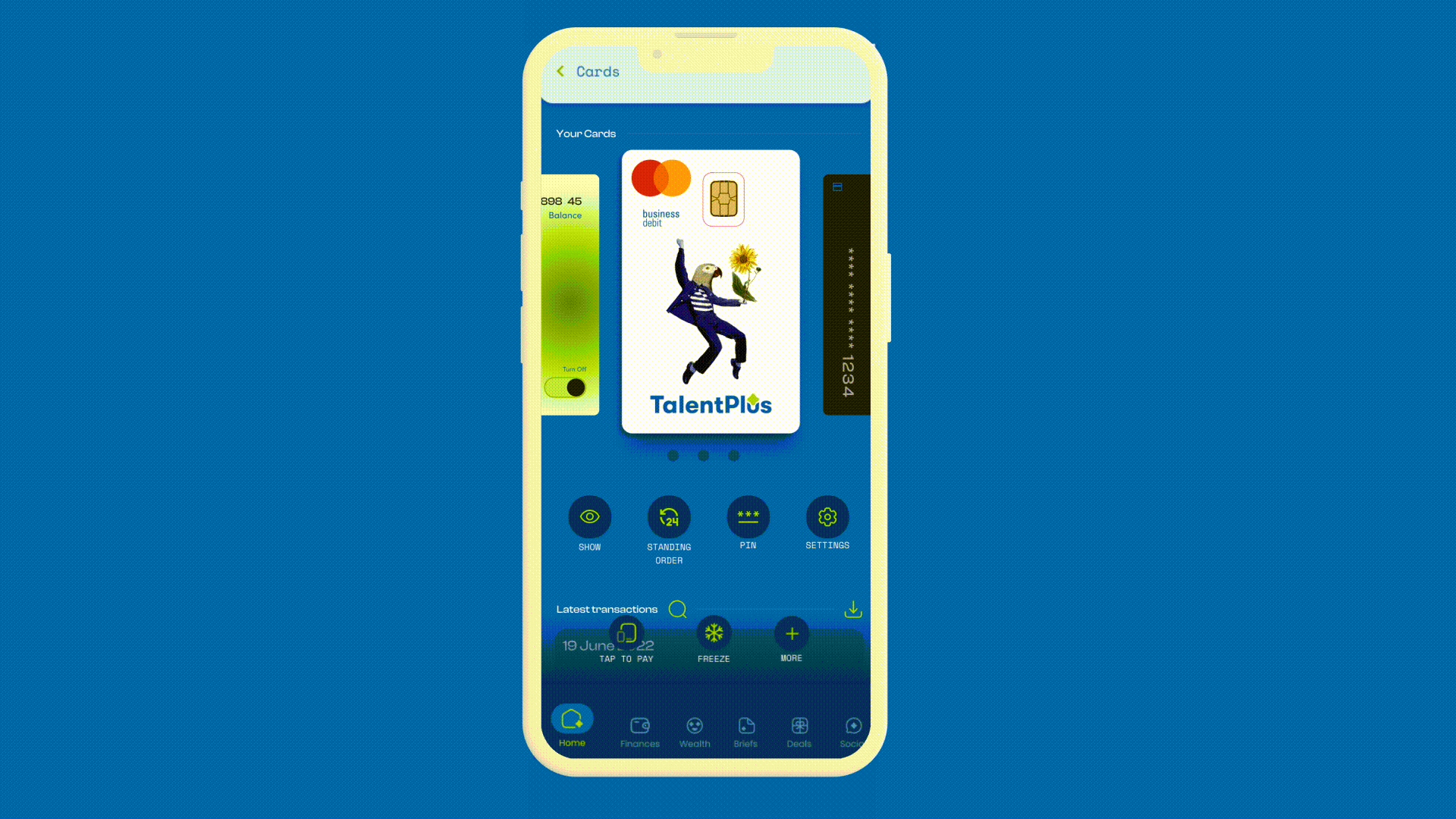
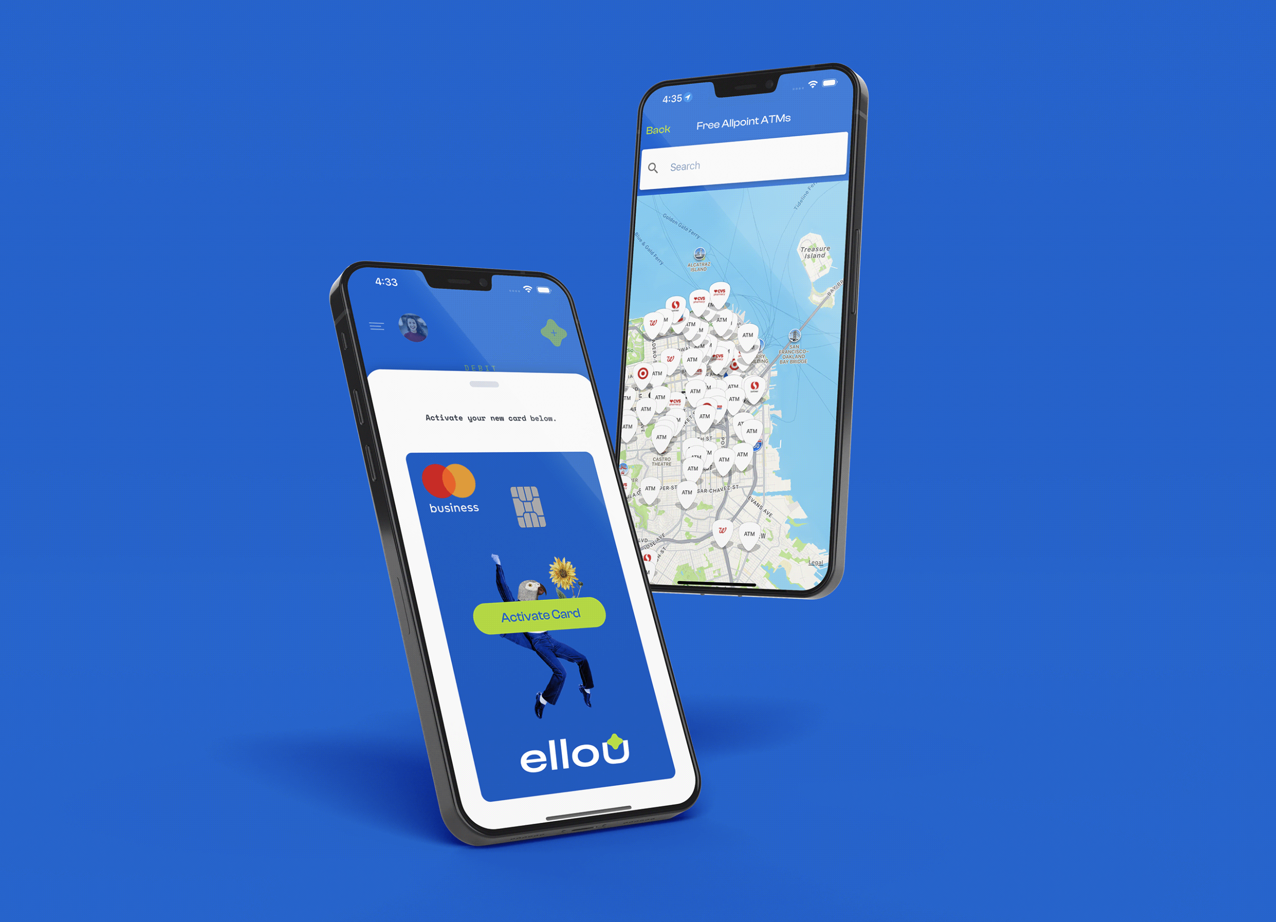
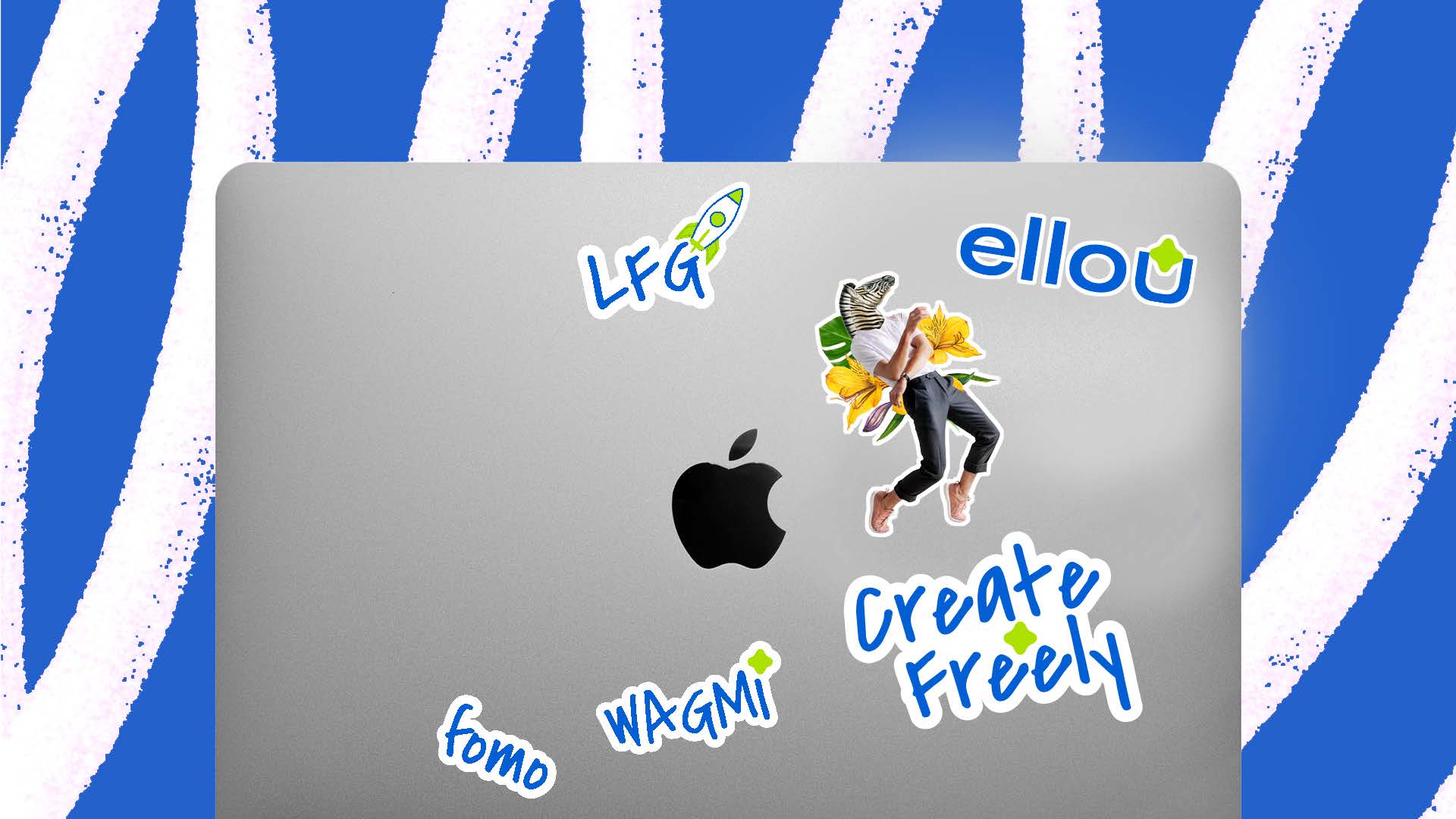
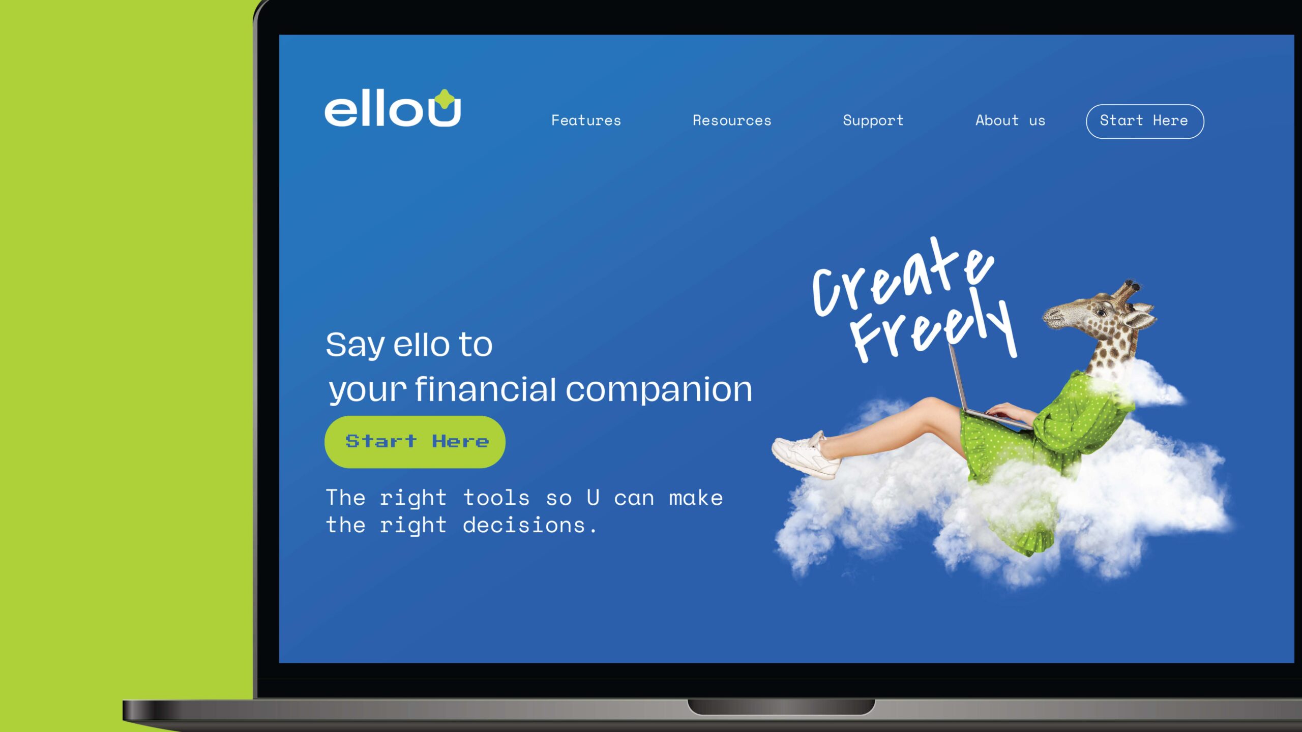
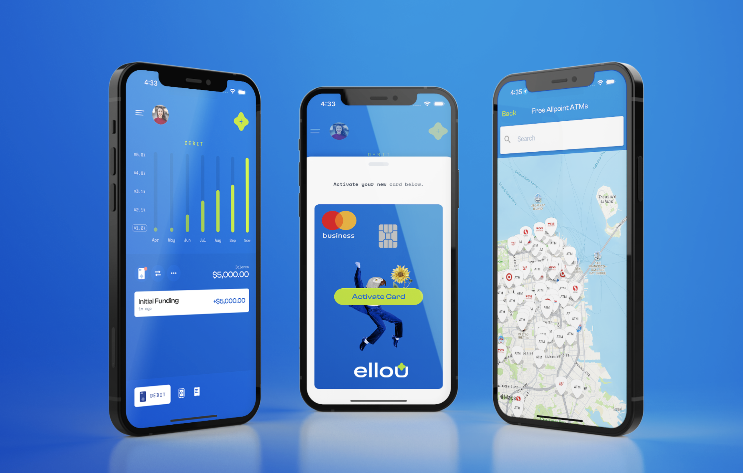
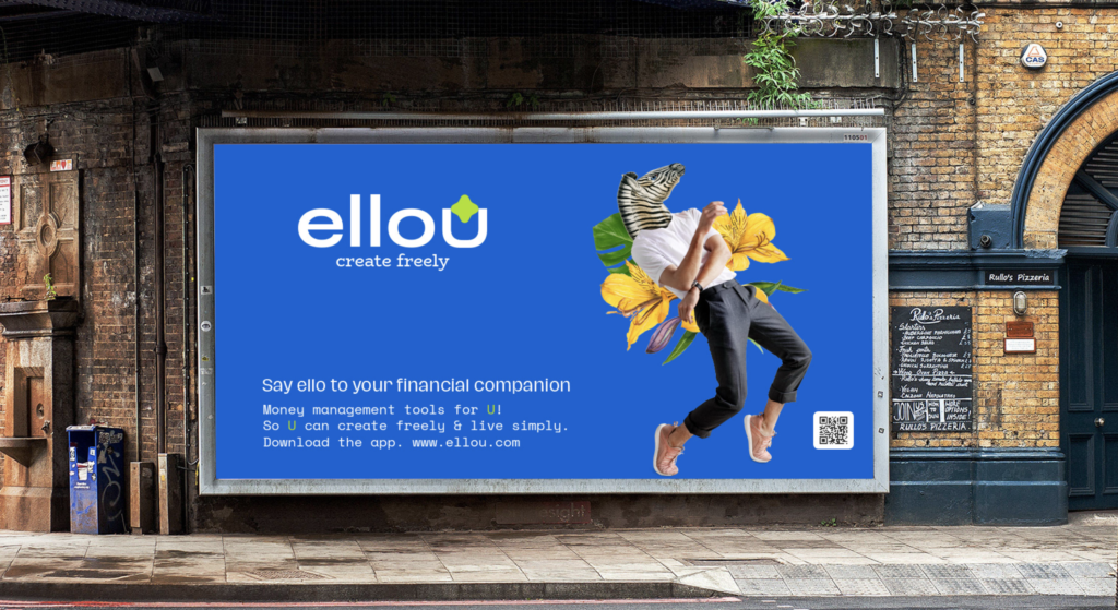
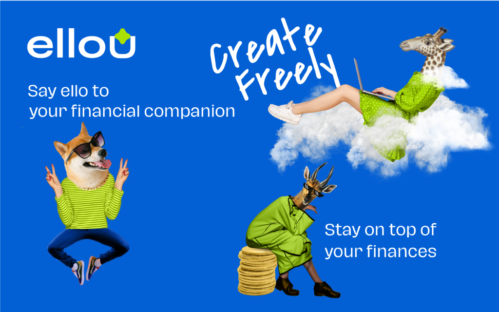
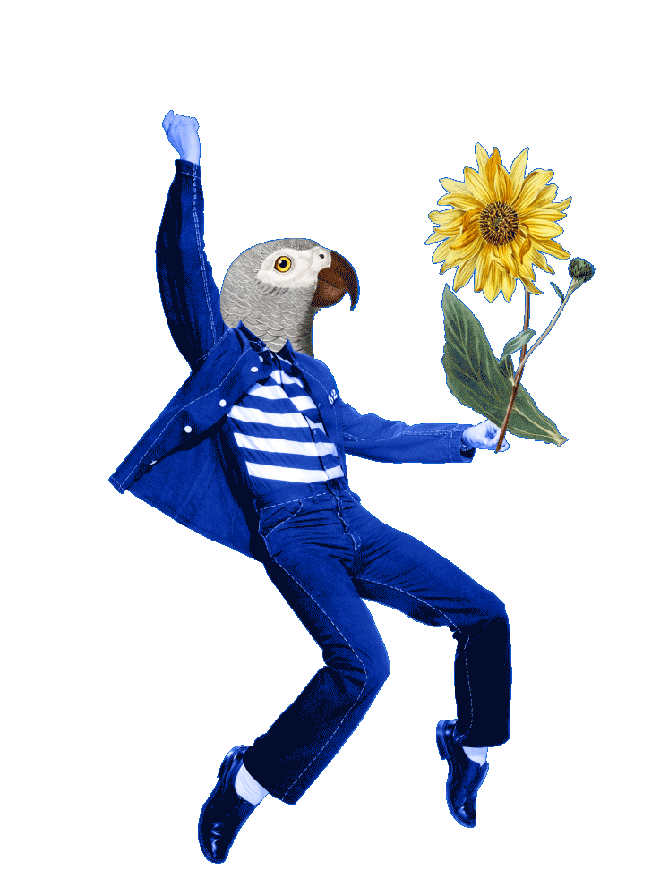
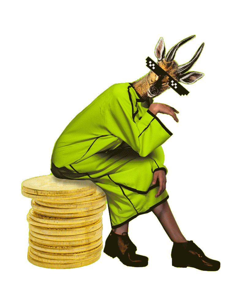
But elloU was built for a different crowd. People who build things by hand. People who collage their days together. People who live in layers of sound, mood boards, half-finished sketches, too many tabs, too many dreams.
So the brand had to feel less like a bank and more like a creative hub. A place with personality. A place with pulse. Because for young creatives, trust isn’t built by removing complexity. It’s built by removing distance. Most fintech brands talk to them like accountants. elloU talked to them like collaborators. This wasn’t “fun for fun’s sake.”
💙 It was strategy through craft. In a category drowning in sameness, every choice signaled: “You belong here. This was built for how you think.” And that’s the real lesson for founders: Don’t ask, “What do fintech brands usually look like?” Ask, “What visual language does my audience trust?” When a brand mirrors the world of the people it serves, it stops competing; it connects. And in fintech, belonging is everything.
Can design make people trust an institution they’ve never trusted before? Curious to hear your thoughts. 👇
If you’re building a fintech or tech product and your brand feels too safe, too similar, or too generic, I can help you craft an identity that actually cuts through the noise and earns trust. DM me or drop a comment, happy to take a look at your brand and share a few ideas.